A new seancoates.com
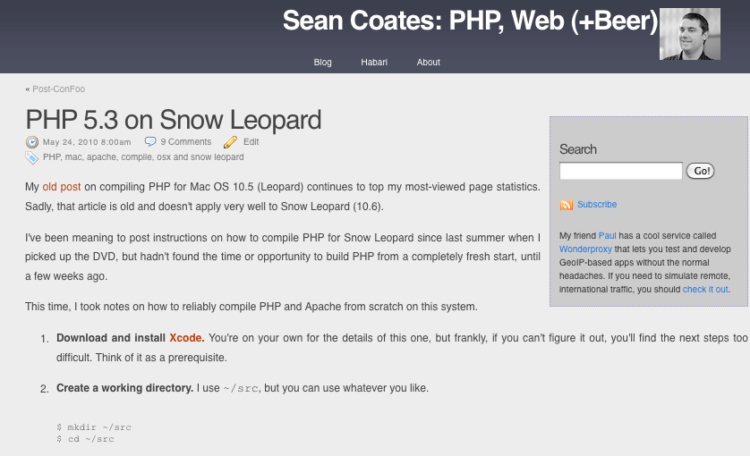
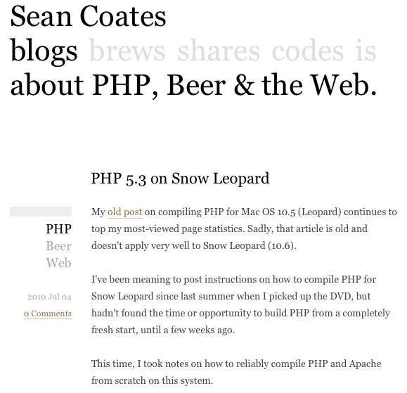
Over the past few weeks, my business partner Cameron and I have spent evenings, late nights, and weekends (at least partially) working on a much-improved seancoates.com.


If you’re reading this via my feed, or through a syndication outlet, you probably hadn’t noticed.
The primary goal of this change was to reduce (hopefully even remove) the ugliness of my main presence on the Web, and I’m very happy with the results.
In addition to making things look nicer, we also wanted to improve the actual functionality of the site. Formerly, seancoates.com was a blog, with a couple haphazard pages thrown in. The new version serves to highlight my blog (which I fully intend to pick up with more frequency), but also contains a little bit of info about me, a place to highlight my code and speaking/writing contributions, and a good place for me to keep my beer recipes.
Cameron came up with the simple visual design and great interaction design, so a public “Thank You” is in order for his many hours of thought and contribution. Clearly, the ugliness reduction was his doing (due to my poorly-functioning right brain).
I’m very happy with how the site turned out as a whole, and thought I’d outline a few of my favourite bits (that might otherwise be missed at first glance).
URL Sentences
The technique of turning URLs into sentences was pioneered by my friend and colleague Chris Shiflett. Cameron (who shares studio space (and significant amounts of beer) with Chris) and I both like this technique, so we decided to implement it for my site.
The main sections of the site are verbs, so this was pretty easy (once we decided on proper nomenclature). Here are a few examples:
-
seancoates.com/blogs– Sean Coates blogs… -
seancoates.com/blogs/about-php– Sean Coates blogs about PHP (my “PHP” blog tag) -
seancoates.com/brews– an index of my published recipes -
seancoates.com/brews/coatesmeal-stout– the recipe page for Coatesmeal Stout
To complement the URLs, the page title spells out the page you’re viewing in plain language, and the visual site header indicates where you are (while hopefully enticing you to click through to the other sections).
Moving my blog from the root “directory” on seancoates.com to
/blogs caused my URLs to break, so I had to whip up yet another
bit of transition code to keep old links functioning. Even links on my
original blog (which was hosted on blog.phpdoc.info) should still
work. If you find broken links, please let me know.
Vertical Content Integration
My “/is” page contains feeds from Twitter and Flickr.
The Twitter integration was pretty simple; I use the JSON version of my user feed, but I didn’t want to include @replies, so they’ve been filtered out by my code. If the fetch was successful, the filtered data is cached in APC for a short period of time so that I’m not constantly hammering Twitter’s API.
Flickr’s integration was also very simple. After a run-in with some malformed JSON in their API, I decided to integrate through their Serialized PHP Response Format. The resulting data is also cached in APC, but for a longer period of time, as my beer tasting log changes much less frequently.
Code Listings
Displaying code listings on a blog isn’t quite as easy as it sounds. I recently had a discussion with a friend about redesigning his site, and he was considering using Gist from Github’s pastebin-like functionality. Doing so would have given him easy highlighting, but one thing he hadn’t considered was that his blog’s feed would be missing the embedded listings (they come from a third party, and wouldn’t actually appear in his feed’s data stream).
Another problem we faced was one of space. While I often try to keep code
to a maximum of 80 (or slightly fewer) characters wide, this isn’t always
possible. Injecting a line break into the middle of a line of code is risky,
especially for things like SSH keys and URLs. This problem is usually solved
by setting the content’s CSS to overflow: scroll, but that
littered Cameron’s beautiful design with ugly platform-specific scroll bars.
“Clever” designers and developers sometimes overcome this by implementing
“prettier” scroll bars, but I’m
strongly
against
this behaviour, so I wouldn’t have it on my site.
I’m quite happy with our eventual solution to this problem. Now, when a blog post contains code that extends beyond the normal width of the blog’s text, the right-most part of the text fades to white, and the listing is clickable. Clicking expands all listings on the page to the minimum width that will accommodate all embedded code.
Here's some example code that stretches much wider than this column would normally allow.
Injecting line breaks is dangerous. Here's why: http://example.com/obviously/not/a/sentence/url
Breaking that in the middle is far from ideal.
jQuery saved me hours of development work here, and I couldn’t recommend it more highly. Highlighting is provided by a plugin that I wrote a couple years ago. It uses GeSHi to highlight many languages. I’ve never been very happy with GeSHi’s output, but it’s Good Enough™ until I can find time to implement a better solution that uses the Tokenizer for PHP.
Software
In addition to PHP, this site integrates a custom version of
Habari, with our own theme and
plugins. One of those plugins allows me to keep my blog posts in HTML files in
my Git repository, to make for much easier editing, greping,
etc.
Everything except /blogs was built within the
Lithium framework. It handles all of the
boring stuff like controllers, routing, and templates, so I didn’t have to
write that code myself (which I find incredibly boring these days).
Hashgrid was invaluable in ensuring that
the site aligns with a visual grid (again, thanks to Cameron’s meticulous
expertise). Pressing your g key will show the grid he used. I
even made a few improvements
to how Hashgrid works, which I hope to eventually see in the master branch.